
The Push reveals bold rebrand for 40th anniversary via SICKDOGWOLFMAN
The project involved redefining The Push’s purpose, positioning, tone of voice, and visual identity.

The Push has unveiled a new brand identity to mark its 40th anniversary, partnering with SICKDOGWOLFMAN to refresh its approach to connecting with young Australians.
The rebrand reflects The Push’s long-standing mission to provide equitable access to music programs and live events, having supported early careers of artists including Something For Kate, King Stingray, Baker Boy, Mallrat, Alex Lahey and Courtney Barnett.
A brand built for youth culture
The project involved redefining The Push’s purpose, positioning, tone of voice, and visual identity, giving the organisation a clearer, more confident way to communicate its role in youth music culture.
Jake Turnbull, design director at SICKDOGWOLFMAN, said the work aimed to capture the organisation’s cultural impact.
“It’s not every day you get to be a part of that, and to work with such genuinely passionate people. It’s been thoroughly rewarding, and props to them for buying an idea that involves death metal typography, anarchy symbols and ‘the cool S’!”,” he said.
Loud, flexible design system
At the centre of the rebrand is a dynamic logo system and a vibrant colour palette designed to reflect the idea that “music is for everyone”.
A custom typeface, Headline Act, draws inspiration from a wide range of music genres, allowing the brand to flex across different tones and audiences through bold, expressive typography.

The leading media trade publication in Australia.
Get our top stories straight to your inbox daily by signing up to our Newsletter
Designed for connection
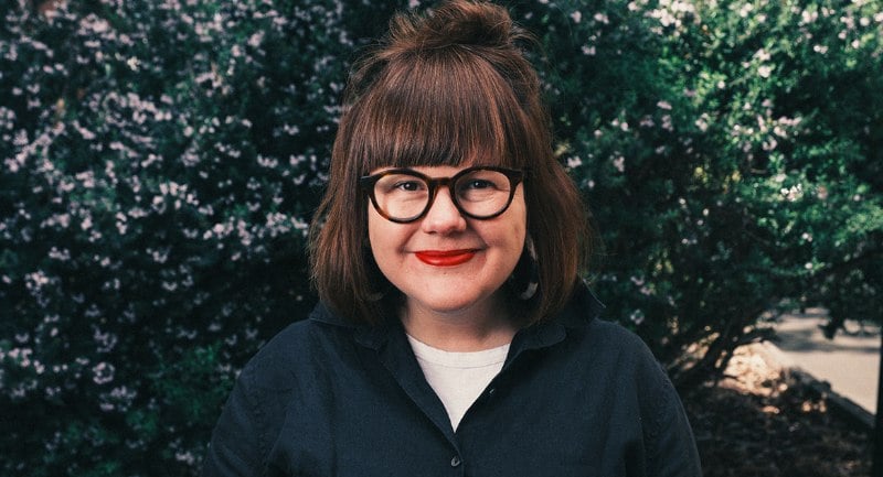 Kate Duncan
Kate Duncan, CEO of The Push, said the new identity has strengthened the organisation's engagement with young people.
“Working with SDWM has given us the clarity and confidence to communicate who we are in a much more direct and meaningful way,” she said.
“The tone of voice reflects how young people actually speak about music. It’s grounded, optimistic and has made a real difference in how we connect, particularly with young people who may not have previously seen themselves reflected in organisations like ours.”
Duncan added that the visual identity captures the energy and diversity of the communities they work with.
"It’s helped us show up in a way that feels both credible and genuinely representative of young people across the country.”
Top Image: The Push


